library(ggplot2)
library(agridat)
library(gridExtra)
ggplot2 syntax follows a set of consistent rules across all plot types. First you use the ggplot function to declare that you want to make a plot using ggplot2. Within ggplot you can put in what data you are going to be using and x, y etc arguments that you want the whole plot to use. After you’ve written out the ggplot object you can declare what type of plot you want using a geom_ function. There are many geom functions, for scatterplots, boxplots, line plots etc etc. You can declare multiple geoms within one plot, e.g. if you want a smoothed line over a scatterplot you would call geom_point() + geom_smooth(). You can override the dataframe and graphical parameters within the geom argument if needed.
archbold.apple$spacing <- as.factor(archbold.apple$spacing)
ggplot(archbold.apple,            #declare the dataframe you want to use (this is from the agridat package)
       aes(x=spacing, y=yield)) + #set the x and y parameters
  geom_boxplot()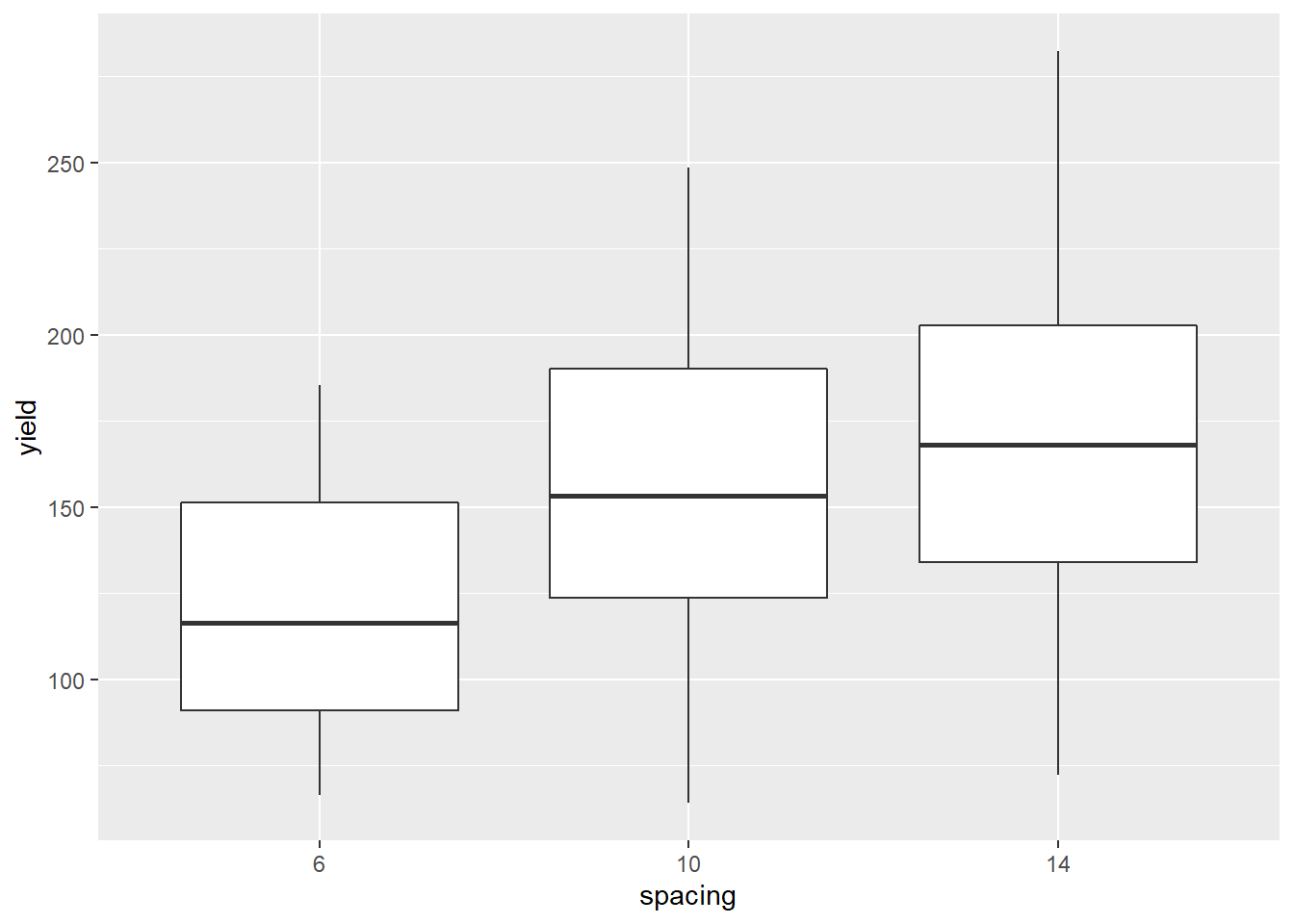
ggplot(archbold.apple, aes(x=pos, y=yield)) +
  geom_point() +
  geom_smooth()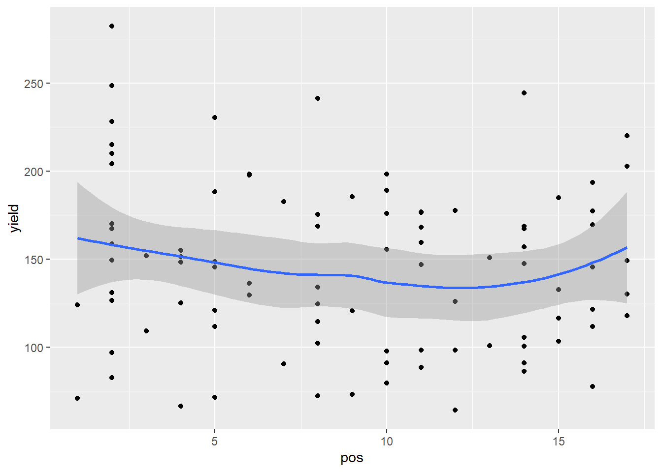
ggplot(archbold.apple, aes(x=pos, y=yield, colour = stock, fill = stock)) +
  geom_point() +
  geom_smooth(method = "lm")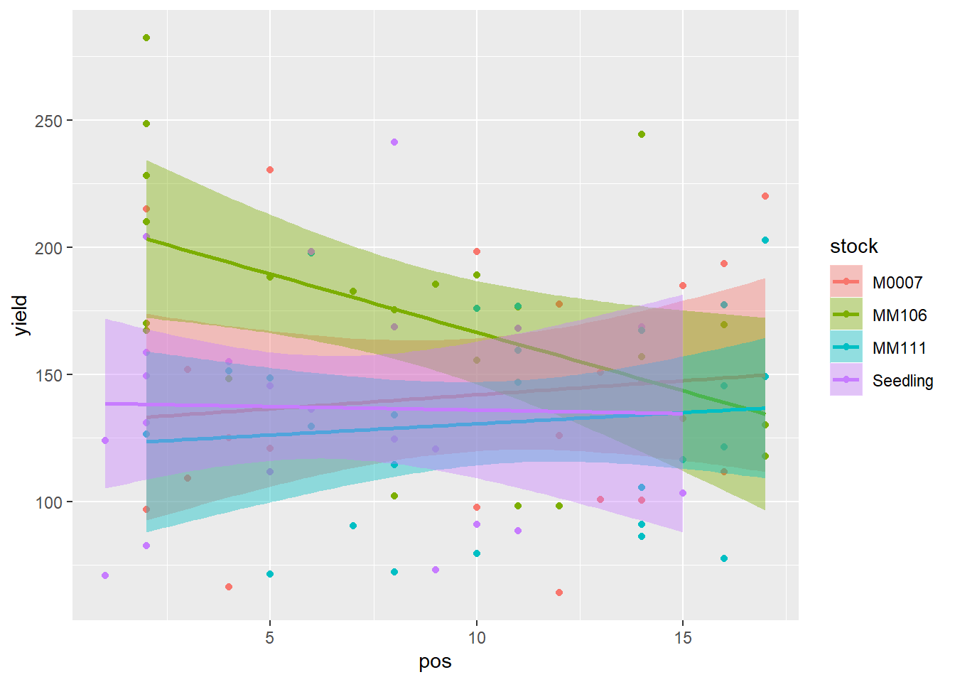
Text on plots
You can put text on plots in specified locations, e.g.:
library(ggrepel)
ggplot(mtcars, aes(wt, mpg, label = rownames(mtcars))) +
  geom_text_repel() +
  geom_point(color = 'red') +
  theme_classic(base_size = 16)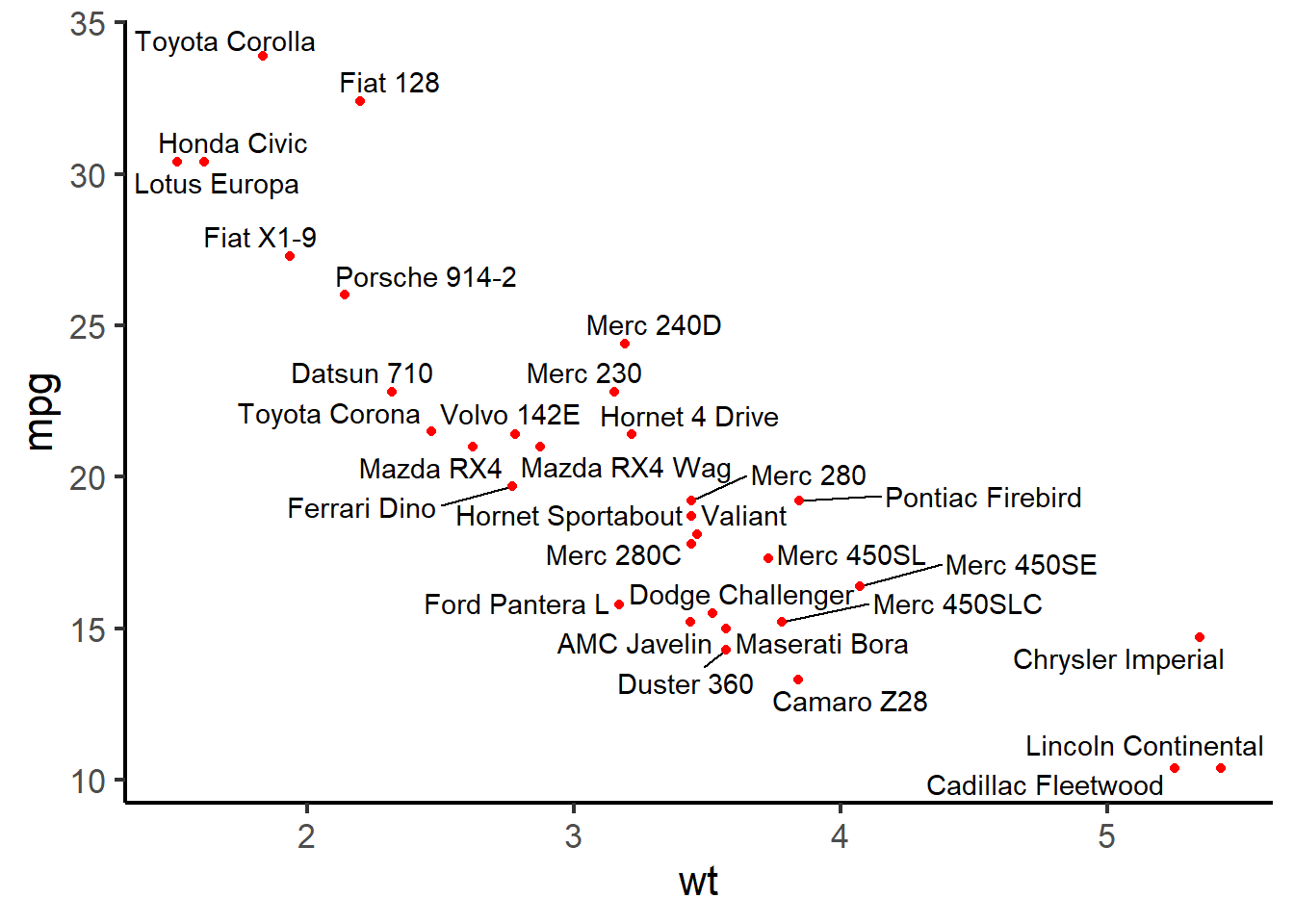
Here I’ve used the ggrepel package to make sure text labels do not overlap, see the vignette for more examples.
Changing the look of a ggplot plot
Colour scheme
The colour scheme used by ggplot2 can be changed by adding either the scale_colour_ or scale_fill_ functions, there are a few different versions of these functions. I’ve used ColorBrewer ones a fair bit, see the website for examples. There are many packages that provide colour palettes, and you can also manually specify colours using scale_colour_manual or scale_fill_manual.
ggplot(archbold.apple, aes(x=pos, y=yield, colour = stock)) +
  geom_point() +
  geom_smooth(method = "lm") +
  scale_color_brewer(palette = "Set2")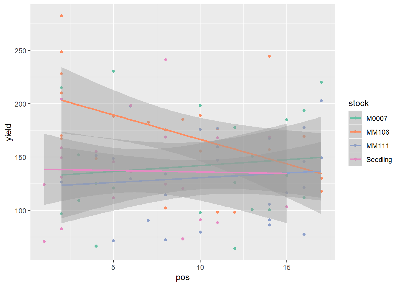
Some of my favourite packages for ggplot2 colour schemes are ggthemes, which has an eight-colour colourblind safe categorical/qualitative palette (colorbrewer only goes up to 4 colours in a colourblind friendly qualitative palette) and ggsci which has palettes that correspond to various journals and sci-fi shows.
Themes
ggplot2 controls the look of plots by referring to themes, the default is theme_gray which has a grey background and white gridlines, as above. You can control the look of plots by changing the theme, either by altering some arguments to theme or by picking a whole new theme. There are multiple themes within ggplot, and other packages such as ggthemes.
ggplot(lehner.soybeanmold, aes(x=mold, y = yield, colour = trt)) +
  geom_point() +
  theme_classic()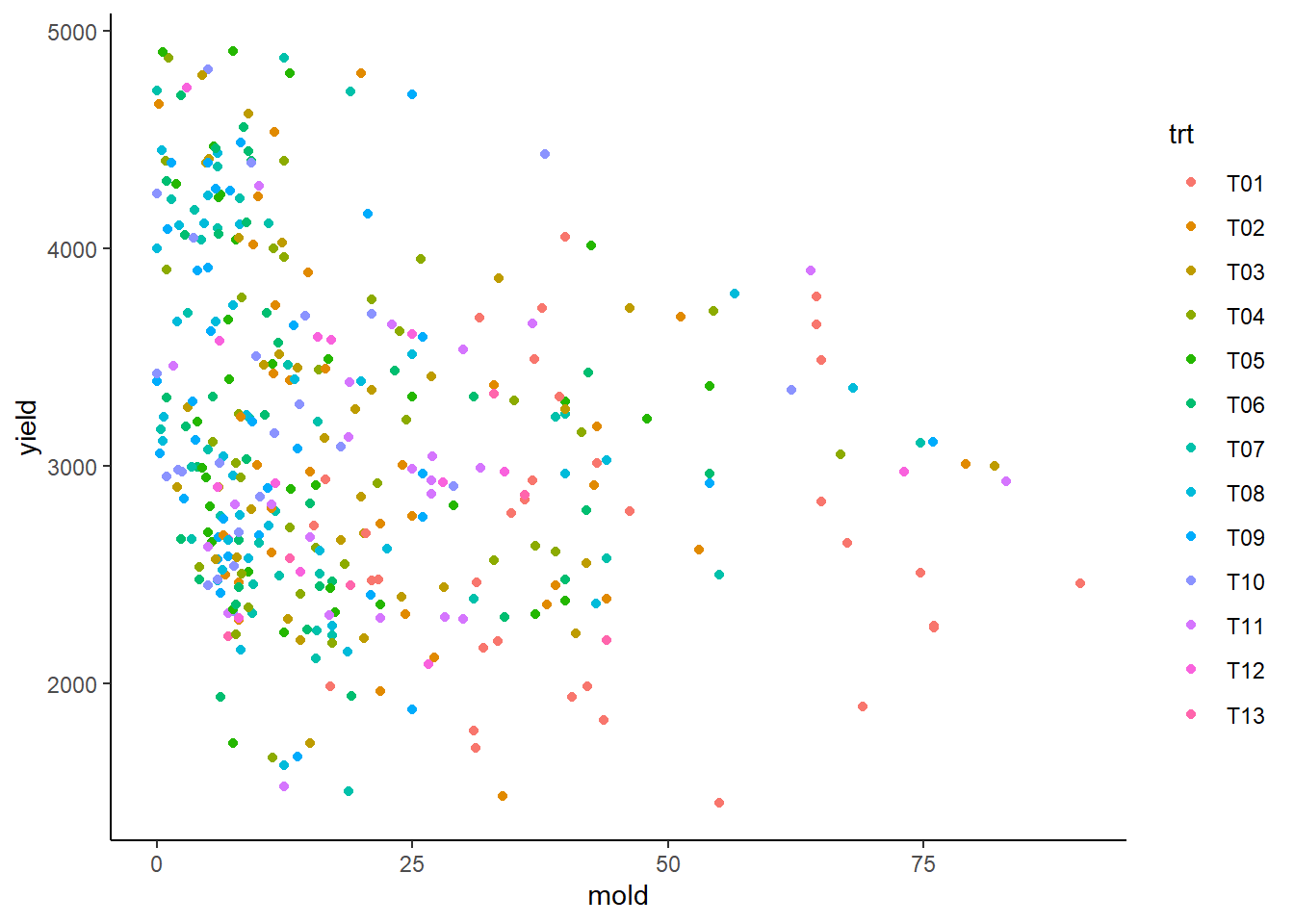
library(ggthemes)
ggplot(lehner.soybeanmold, aes(x=mold, y = yield, colour = trt)) +
  geom_point() +
  theme_gdocs()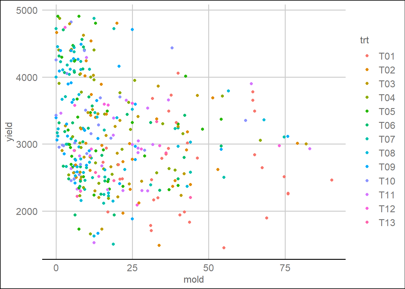
ggplot(lehner.soybeanmold, aes(x=mold, y = yield, colour = trt)) +
  geom_point() +
  theme_excel()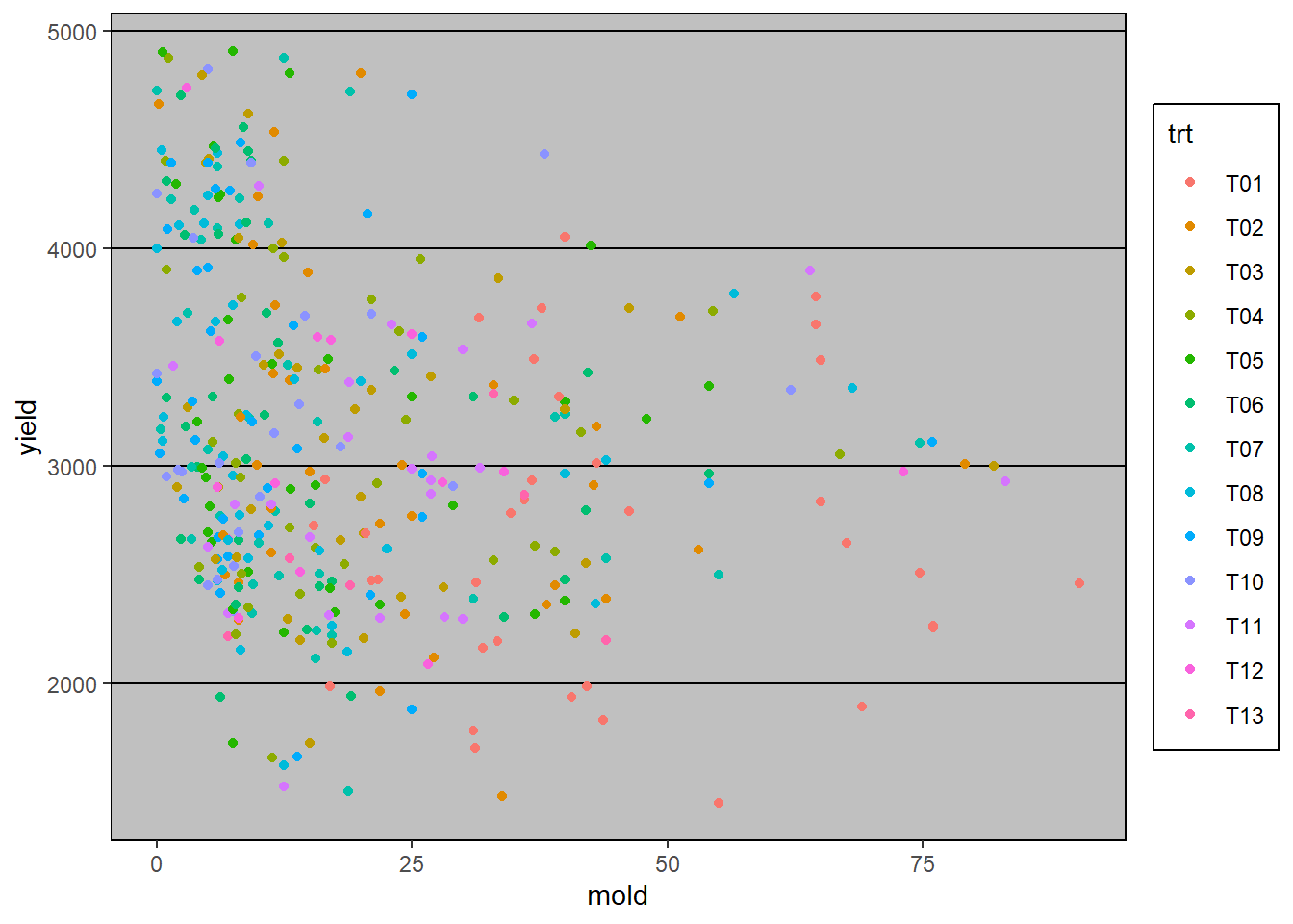
Setting themes
If you have a theme you want to use over and over again within a piece of code you can set it at the beginning of the script and all plots after that will use that theme.
theme_set(theme_bw() + theme(panel.grid = element_blank(),
                             axis.text = element_text(colour = "black")))

ggplot(lehner.soybeanmold, aes(x=mold, y = yield, colour = trt)) +
  geom_point()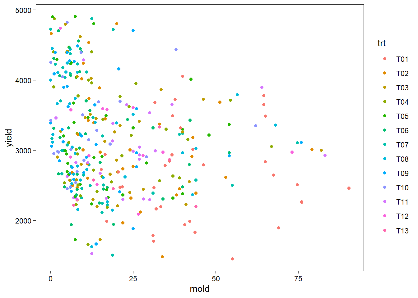
Interactively changing the appearance of a plot
There is a ggplot2 extension called ggedit which can be used to interactively edit the appearance of a ggplot. Once installed it can be accessed by either the Addins button on RStudio or by running some code:
require(ggedit)

plot <- ggplot(lehner.soybeanmold, aes(x=mold, y = yield, colour = trt)) +
  geom_point()
ggedit(plot)
Saving plots
Plots can be saved using the user interface in RStudio through the export button on the plots window. However ggplot2 also has a handy function for saving plots called ggsave which can be great for keeping a record of exactly how you saved the plot (e.g. height, width etc). It defaults to the last plot created but that can be overwritten using the plot argument.
plot_violin <- ggplot(archbold.apple, aes(x=spacing, y=yield)) +
  geom_violin()

# save to png
ggsave("apple_violin.png", plot = plot_violin, device = "png",
       width = 10, height = 10, units = "cm")

# save to pdf
ggsave("apple_violin.pdf", device = "pdf",
       width = 15, height = 20, units = "cm")
Multiple plots in one
Facetting plots
ggplot(nass.corn, aes(x=year, y=acres)) +
  geom_line() +
  facet_wrap(~state) +
  labs(x="Year", y="Bushels per acre of corn")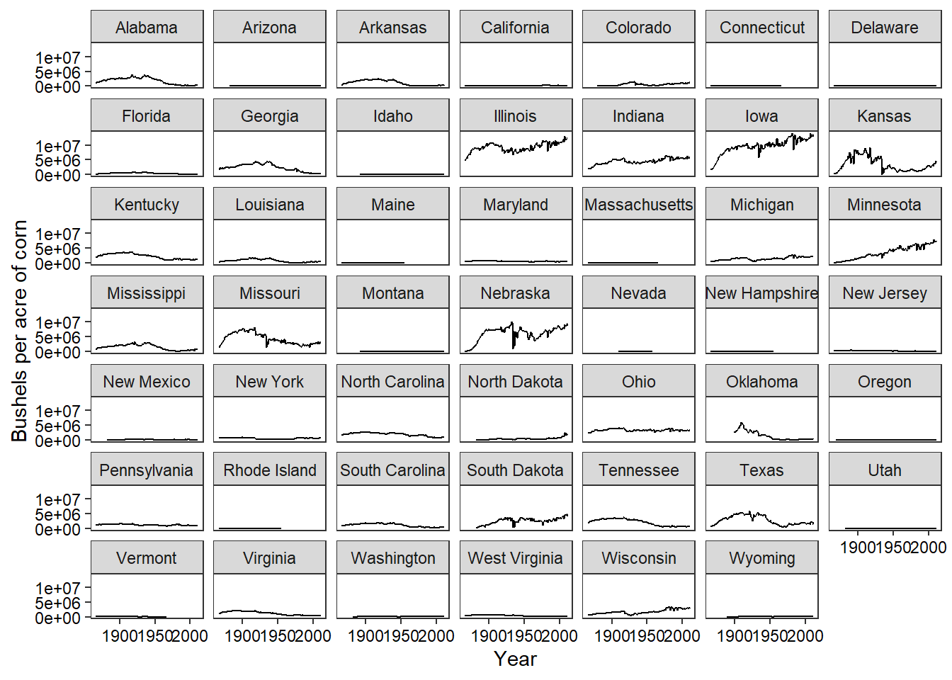
Facetted plots can be split over multiple pages using the ggforce package:
require(ggforce)
ggplot(nass.corn, aes(x=year, y=acres)) +
  geom_line() +
  facet_wrap_paginate(~state, nrow = 4, ncol = 4, page = 1) +
  labs(x="Year", y="Acres of corn")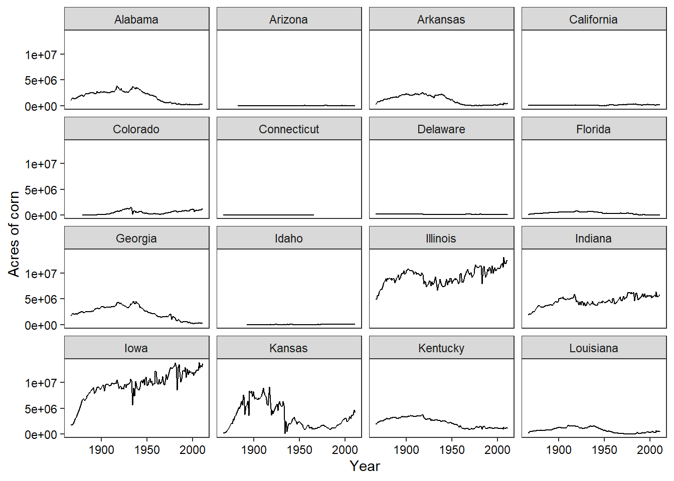
ggplot(nass.corn, aes(x=year, y=acres)) +
  geom_line() +
  facet_wrap_paginate(~state, nrow = 4, ncol = 4, page = 2) +
  labs(x="Year", y="Acres of corn")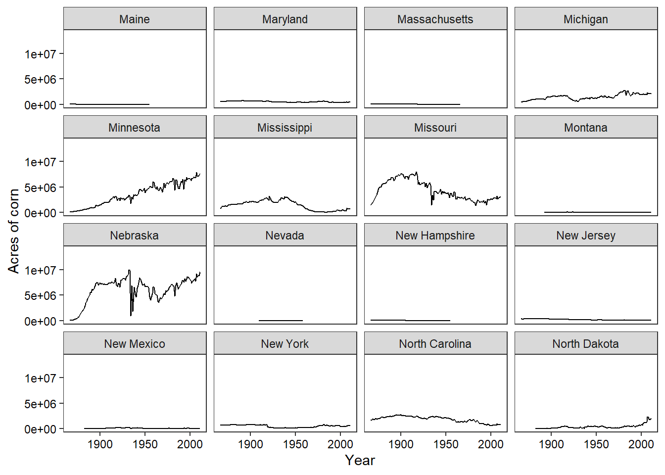
Combining plots with gridExtra
barley <- ggplot(subset(nass.barley, state %in% c("Idaho","Illinois","Indiana", "Iowa")),
                 aes(x=year, y=acres, colour = state)) +
  geom_line(size=2) +
  labs(x="Year", y="Acres harvested") +
  ggtitle("Barley")

wheat <- ggplot(subset(nass.wheat, state %in% c("Idaho","Illinois","Indiana", "Iowa")),
                 aes(x=year, y=acres, colour = state)) +
  geom_line(size=2) +
  labs(x="Year", y="Acres harvested") +
  ggtitle("Wheat")

grid.arrange(barley, wheat)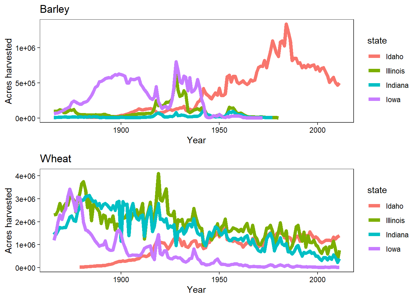
Saving gridExtra objects can be done by…
ggsave("Gridextra.png", plot= grid.arrange(barley, wheat), device="png")Using different fonts
The extrafont package can be used to use a wide variety of different fonts within your plots in R. It has to be installed and then the fonts imported into R, which can take several minutes. This only needs to happen once though, after you’ve installed it you can then just load it in future R sessions and it should allow access to all the fonts you have installed on your computer.
install.packages("extrafont")
library(extrafont)
font_import()
loadfonts()
fonts()
If you already have extrafont on your system you can just load it in using the library command and use the text argument within the theme function to set the font family to your choice.
library(extrafont)

ggplot(nass.cotton, aes(x=year, y=acres)) +
  geom_line() +
  facet_wrap(~state) +
  labs(x="Year", y="Acres of cotton") +
  theme(text = element_text(family = "Segoe Print"))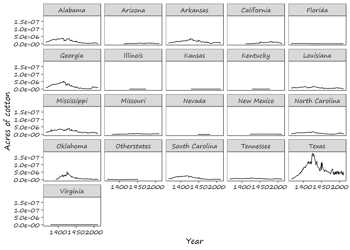
If you are saving your plots to pdf you need to embed the fonts within the file, which can be done using the Cairo package and saving to cairo_pdf instead of pdf
library(Cairo)
cotton <- ggplot(nass.cotton, aes(x=year, y=acres)) +
  geom_line() +
  facet_wrap(~state) +
  labs(x="Year", y="Acres of cotton") +
  theme(text = element_text(family = "Segoe Print"))

ggsave("Extrafont.pdf", plot = cotton, device=cairo_pdf)
Showing a section of a plot
The ggforce package mentioned above has a few interesting functionalities, including the ability to show a zoomed in section of a plot based on data values.
ggplot(pearce.apple, aes(x=prev, y=yield, col = trt)) +
  geom_point(size=2) +
  scale_color_colorblind() +
  facet_zoom(y = trt == "A")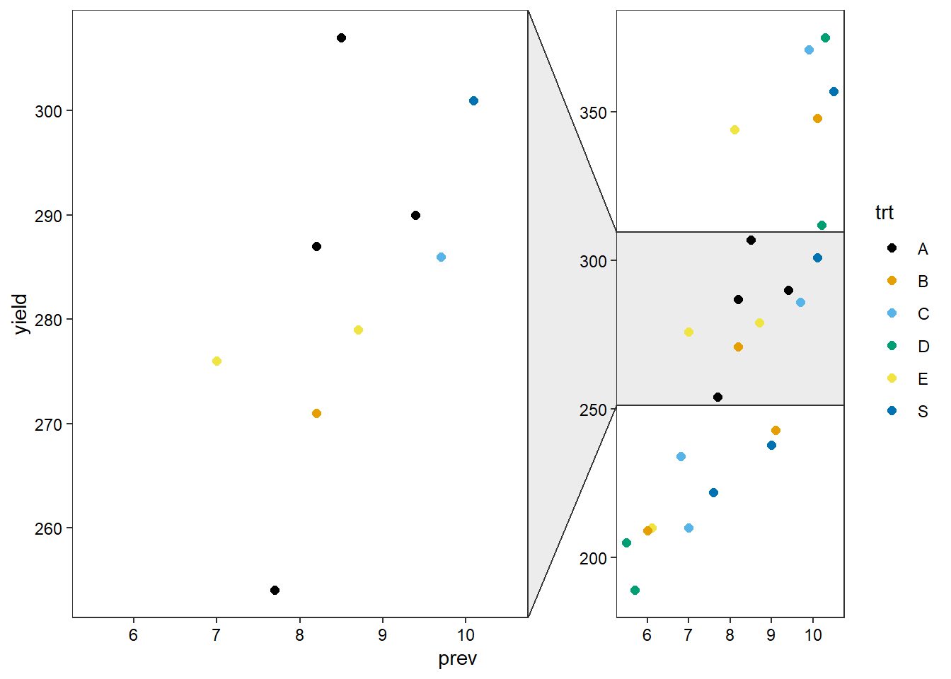
ggplot(pearce.apple, aes(x=prev, y=yield, col = trt)) +
  geom_point(size=2) +
  scale_color_colorblind() +
  facet_zoom(y = trt == "A", x = trt == "A", split = TRUE)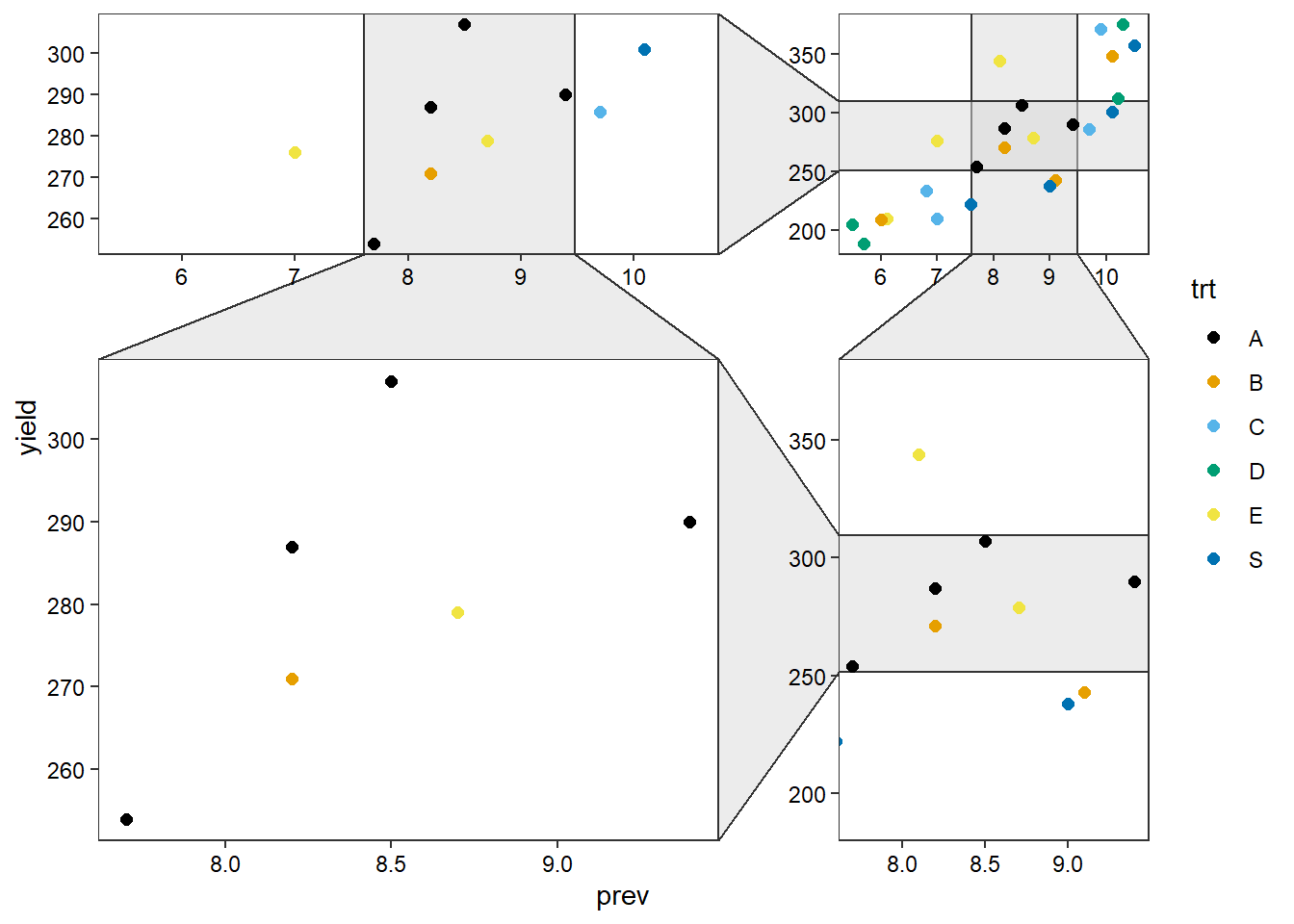
Animated plots
There is a relatively new package called gganimate which can be used to make animated plots. It isn’t on CRAN yet but can be downloaded from github using the devtools package.
# devtools::install_github('thomasp85/gganimate')
library(gganimate)
library(gapminder)
This can be used to make animated plots, by default as gifs - this example is from the github repository of gganimate.
ggplot(gapminder, aes(gdpPercap, lifeExp, size = pop, colour = country)) +
  geom_point(alpha = 0.7, show.legend = FALSE) +
  scale_colour_manual(values = country_colors) +
  scale_size(range = c(2, 12)) +
  scale_x_log10() +
  facet_wrap(~continent) +
  # Here comes the gganimate specific bits
  labs(title = 'Year: {frame_time}', x = 'GDP per capita', y = 'life expectancy') +
  transition_time(year) +
  ease_aes('linear')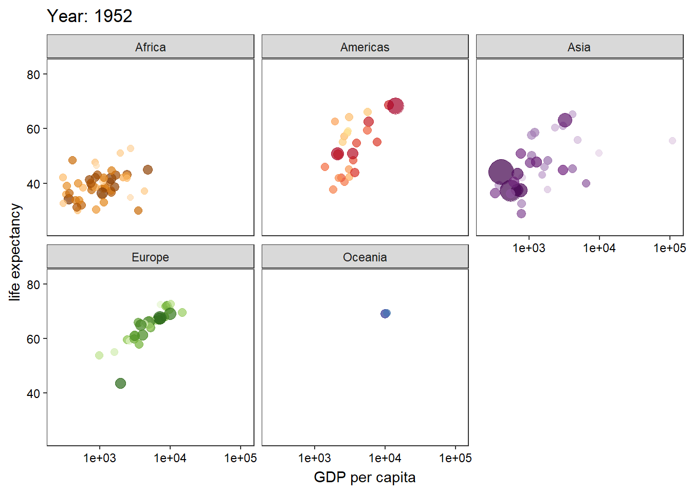
Interactive plots
The package ggiraph has some great functionality for making interactive plots, for example you can make it so that if you put your mouse over a point it will show some label:
require(ggiraph)
gplot <- ggplot(lehner.soybeanmold, aes(x=mold, y = yield, colour = region)) +
  geom_point_interactive(aes(tooltip = trt, data_id = trt)) +
  theme_classic()

girafe(ggobj = gplot)
ggiraph also allows zooming in on plots:
x <- girafe(ggobj = gplot)
x <- girafe_options(x, opts_zoom(max = 5) )
x
There’s more examples online: https://davidgohel.github.io/ggiraph/index.html